

Utsuroi: abstract paintings with Japanese inspiration
LIGHT IN TRANSITION · JORDY KOUMANS
⏱️ 9-minute read
There is a moment when the evening sky is still warm, but the day is already over.
The pink doesn't disappear all at once. First, it becomes duller. Then something grey shifts through it. The darkness draws closer, while a final strip of light still hangs on the horizon.
You can look at it and think: a sunset. But what fascinates me as a painter is precisely that small moment within it. The transition. The instant when a color is no longer entirely what it was just a moment before.
That is what my new collection Utsuroi | Light in Transition is about.
I am Jordy Koumans, the artist behind KOJO Art. From my studio in Carré in Tilburg, I translate my fascination with Japan and nature into original abstract acrylic paintings on panel in this collection. Not painted landscapes, but fields of color that evoke something of dawn, still water, shadow, and the last light.
There is also another important influence: A Dictionary of Color Combinations by Sanzo Wada. His color combinations have played an essential role in the process behind Utsuroi. Nature gives me a moment to imagine; Wada helps me look more closely at the colors with which I can evoke that moment.
What does Utsuroi mean for my paintings?
Utsuroi (移ろい) refers to change and transition. For me, it is a fitting name for a collection centered on what slowly shifts.
Light that becomes softer. Colors that move toward each other. A landscape that loses its sharpness under a thin haze.
These are not major events. You can easily miss them. Yet it is precisely these moments that continue to fascinate me. Not only because of their beauty, but because they can never be fully grasped. As soon as you think you see exactly what is happening, it has already changed.
With paint, I do not try to literally freeze such a transition. I look for a composition in which some of that movement remains palpable. A strict plane can provide a foothold. Within it, color is allowed to hesitate.
A moment on your wall
View the paintings side by side and discover which colors hold your attention.
Discover the Utsuroi collectionFrom Japanese nature to abstract art
My interest in Japan comes together in this collection with my love of color and composition. My fascination with ukiyo-e, Japanese print art, also resonates through it. Not because I repaint prints, but in the attention to the distribution of planes, cropping, and the atmosphere of a fleeting moment.
How much do you need to evoke a landscape? Do you need to paint a tree to make shelter felt? Does water need a recognizable bank? Can you capture the warmth of a morning without depicting the sun?
In Utsuroi, I leave out many recognizable details. What remains is the relationship between colors. A dark outer plane surrounding a lighter center. A warm tint that slowly becomes cooler. A boundary that is clear in one place and almost disappears in another.
For me, that is where the space of abstract art begins: I give a direction, but not the complete image. What you see in it does not have to be exactly the same as what I have put into it.
I do not paint what a landscape looks like. I look for what remains when you close your eyes.
Sanzo Wada: from color combination to feeling
In addition to my fascination with Japanese nature, A Dictionary of Color Combinations by Sanzo Wada is an important source for Utsuroi. The book helps me to look not only at a single color, but especially at what happens when colors meet.
A pink tint does not tell the same story everywhere. Next to a dark color, it can brighten. Between warmer earth tones, the same tint can become softer. For me, that is the value of Wada's color combinations: they invite me to look beyond the colors I would naturally choose together.
In Utsuroi, those color relationships come together with my own associations with nature and compositions. A palette on paper is not yet a painting. On a panel, the proportions change: one color becomes a large outer plane, another gets space in the center, and between them, transitions emerge. The paint, the scale, and the surrounding colors help determine what ultimately happens.
When you view the works below, pay attention to that meeting between the outer plane and the center. In Asayake, coral red surrounds the softer nuances. In Kokage, olive green stands next to warmer pink-brown tones. In Zanshō, a deep blue-green outer plane makes the light center visible. This way, you can look at the color relationships that have become so important to me, partly thanks to Wada.
In From Book to Canvas: How I Use A Dictionary of Color Combinations in My Work, I show in more detail how I go from a color palette to my own painting. Do you want to get to know the book first? Then read my complete guide to A Dictionary of Color Combinations by Sanzo Wada.
Nature gives me an atmosphere. Sanzo Wada helps me explore the possibilities of color. In the painting, those two come together.
From inspiration to painting: the complete Utsuroi collection
Below, I will take you through all twelve works. For three paintings, I also show a conceptual inspiration image: on the left, the atmosphere I am looking for; on the right, the painting. In between, the moment I try to capture. The other works align with their own image and story.
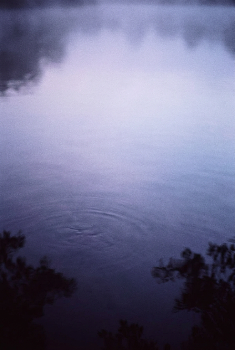 |
01 / THE FIRST LIGHT Between night and dayThe night recedes, but the day is not yet fully there. In that short moment, colors are given space. I look for that soft transition, in which everything still seems possible. Discover Shinonome → |
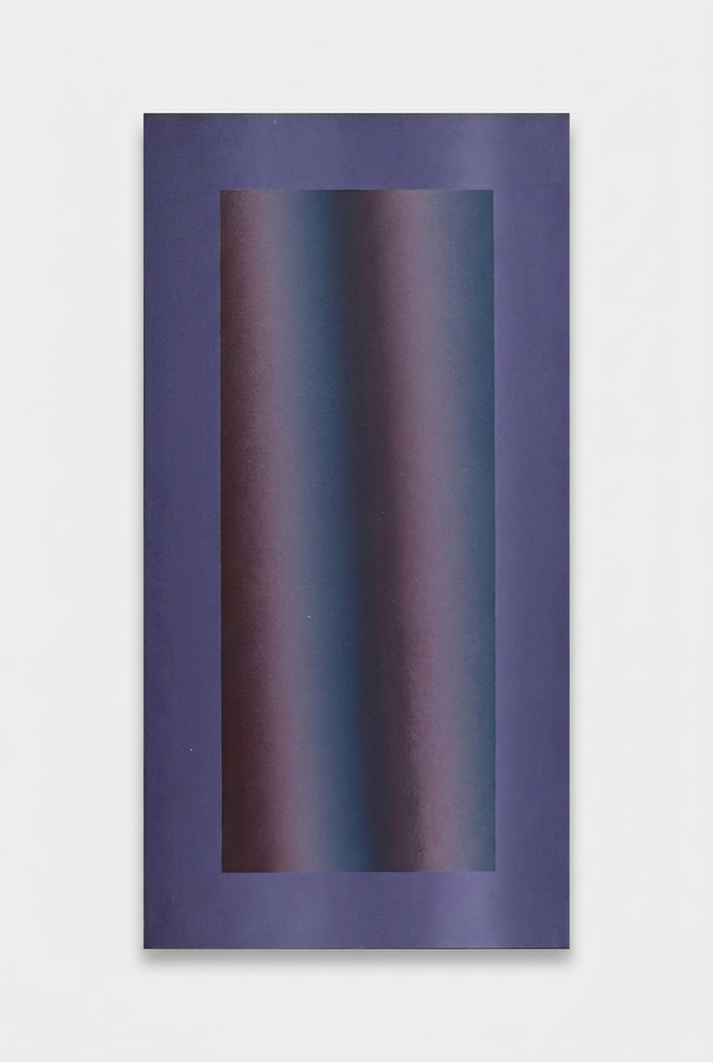 |
Shinonome and Asayake: two moments of the morning
In Shinonome, the night is still present. Muted violet, indigo, and cool blue nuances move next to each other. Something is changing, but gently. Asayake brings a different energy: coral red, dusty pink, and muted terracotta give the first light warmth. Next to each other, these works tell me something about the difference between the anticipation of a new day and the glow that follows.

A morning glow that is still soft, but does not go unnoticed.
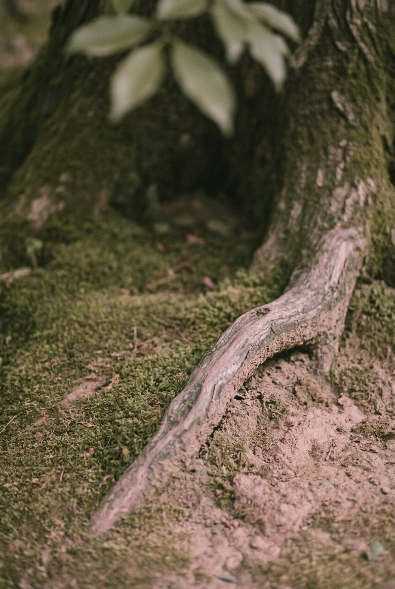 |
02 / IN THE SHADOW Briefly shelteredUnder a tree, the light changes. Colors become softer, the world feels smaller for a moment. Not the tree itself, but that shelter I wanted to bring into my studio. Discover Kokage → |
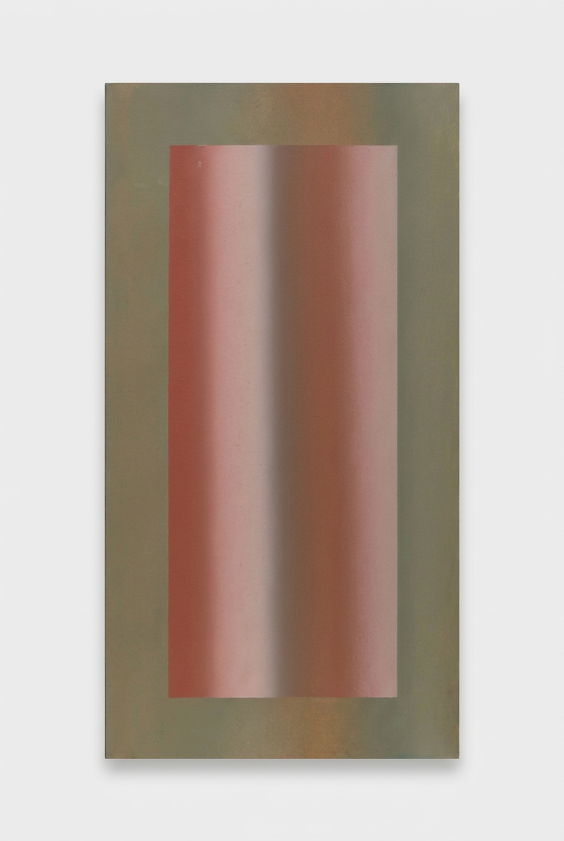 |
Kokage and Komorebi: under the canopy
Sometimes light gains meaning precisely because it is held back. Komorebi is about the filtered light that falls through leaves. Kokage seeks the shelter beneath it. One is about what comes through the canopy. The other about the peace that arises beneath it. Two works that belong together in my mind, without telling the same story.

Olive green and golden yellow bring a soft rhythm to the field of color.
Nagi, Kasumi and Shigure: when boundaries become softer
With Nagi, I think of water after the wind has died down. The surface becomes calmer, but is not empty. Blue, teal, and muted green nuances suggest something of depth and reflection.

For me, calm does not mean that nothing moves anymore.
With Kasumi, the focus shifts to haze. Gray-green and warmer olive tones bring distance and proximity closer together. The colors remain present, but seem to become less pronounced.
Shigure has a darker character. Aubergine, mauve, and warm earth tones refer to a short rain shower in late autumn or early winter. No painted raindrops. I look for the moment when rain changes the colors of a landscape. Everything becomes a little heavier, denser, quieter.

The boundary between near and far becomes softer.

Cool air meets the warmth of the earth.
Chisō and Iwahada: change also has another pace
Not every transition can be seen in a few minutes. Some changes can only be read in layers. Chisō refers to layers of earth. Warm pink-brown tones and a lighter center evoke something of clay, loam, and the depth beneath a surface.
In Iwahada, the skin of a rock takes center stage. Rust brown surrounds softer pink and terracotta nuances. Stone seems immutable, but a weathered surface shows precisely how much has happened. Not the light that shifts over a landscape, but the landscape itself that slowly changes.

Layer after layer, each with its own depth.

Strength and softness in the same composition.
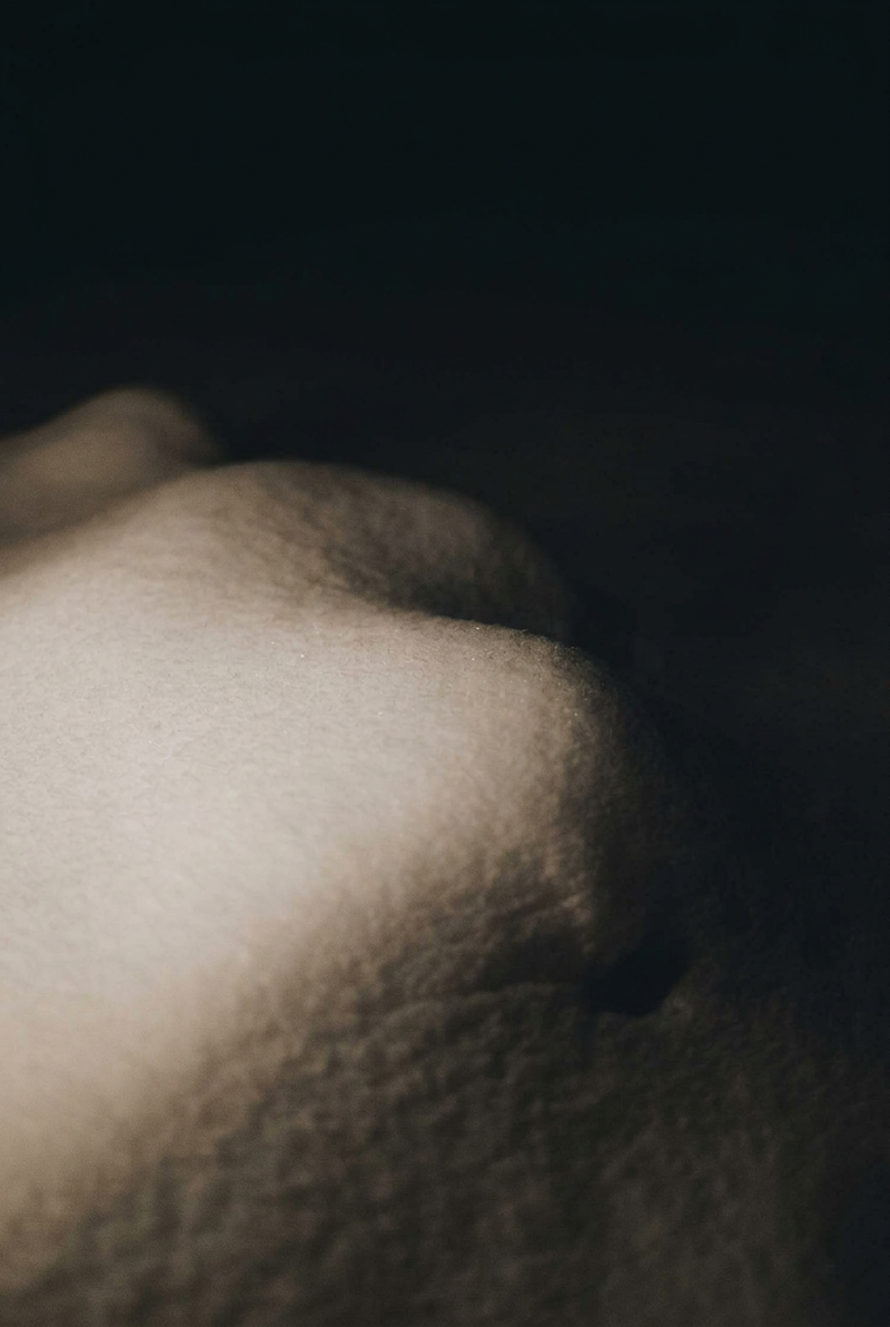 |
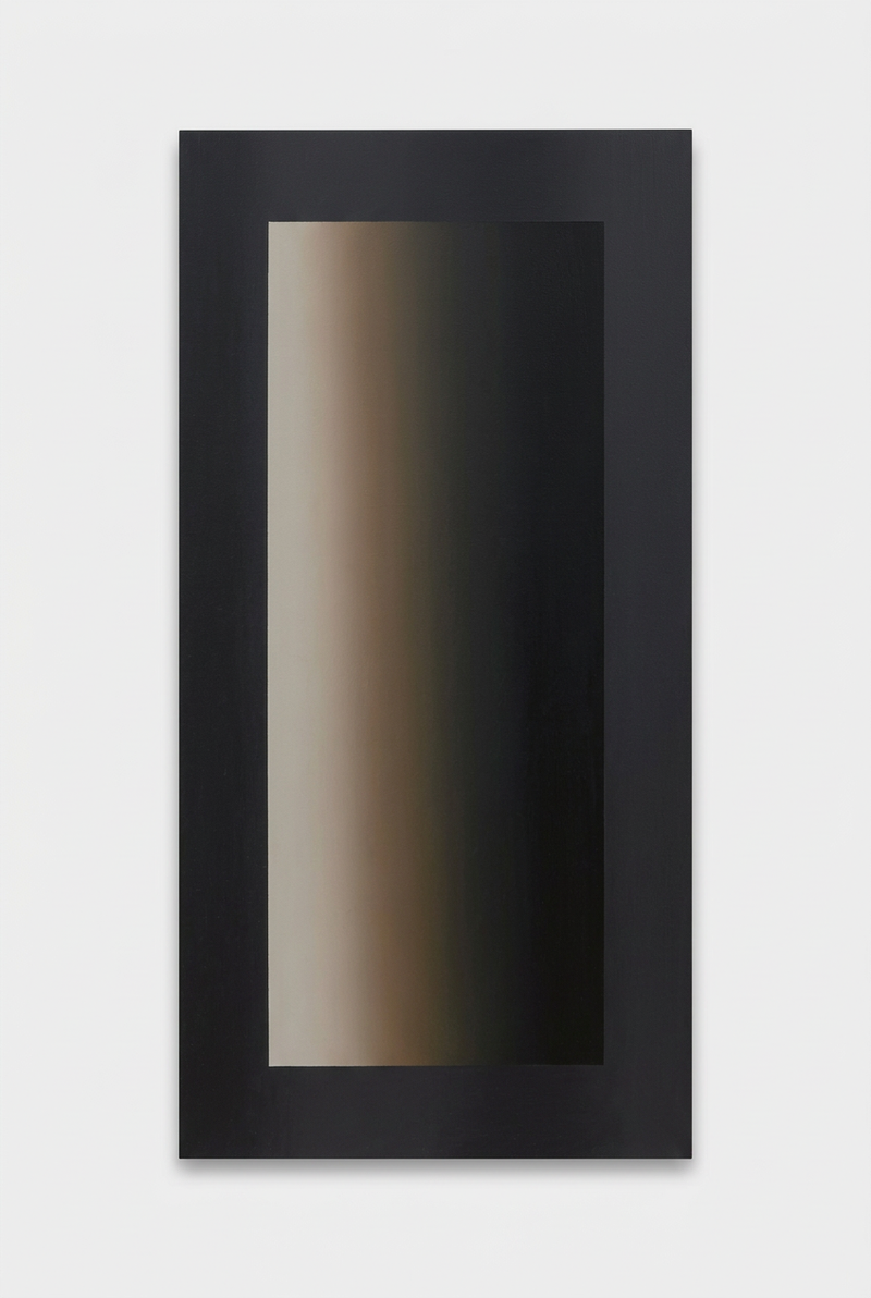
03 / WHAT CONTINUES TO LIGHT UP Silence in the darknessIn the night, snow continues to softly light up. Contours blur. Contrast becomes a transition. Precisely there, where light almost disappears, I want to keep looking longer. Discover Yoru no Yuki → |
 |
Yūyake, Zanshō and Yoru no Yuki: the last light
Yūyake seeks the warm glow of the evening sky. Burnt orange meets mauve and dusty pink. In Zanshō, the darkness draws closer: a deep blue-green outer surface encloses a warmer, lighter center. The last light becomes visible through the depth surrounding it.

The warmth of the day slowly gives way to tranquility.

A warm glow, made visible precisely because the darkness is approaching.
Yoru no Yuki brings the collection into the night. Charcoal black, warm gray and off-white refer to snow that still softly glows when the surroundings have grown dark. I find it remarkable how little light is sometimes needed to still see something.
Why I also paint the space behind the painting
Utsuroi is not just about what happens on the front. I paint the works with acrylic paint on panel. I build up the paint layer by layer, paying attention to soft transitions and the subtle texture of the surface.
On the back is a three-centimeter wooden spacer. This allows the panel to hang parallel to the wall, with space behind it. That back also gets color: Prussian blue.
The distance from the wall and the dark shadow effect make the presentation more spatial. The painting seems to come slightly away from the wall. For me, that is part of the work. The composition does not end completely at the edge of the panel. The shadow around it is also part of it.
Which painting suits your space?
I wouldn't start with the question of which color exactly matches your sofa. Start with the work you keep looking back at.
Perhaps the coolness of Shinonome appeals to you. Perhaps the warm red of Asayake, the shelter of Kokage or the contrast of Zanshō. Then look at the place where it could hang. Measure the wall space and mark out the size with painter's tape. The elongated works are 40 × 20.5 cm; the square paintings measure 40 × 40 cm.
Also give a work some space around it. Not because a wall must remain empty, but so you can give the colors the attention for which you chose the painting. Not sure? You can send me a photo of your space. I am happy to think along with you personally.
Which moment stays with you?
Discover the full collection, view the details and find the work whose colors and story stay with you.
View the full collectionLook further yourself with Sanzo Wada
Are you curious about the book that partly feeds my color research? In my guide to A Dictionary of Color Combinations, I explain more about the book and how I work with it.
You can also view Volume 1 at Athenaeum Scheltema or view Volume 2.
The links to the books are affiliate links. If you order through one of these links, I may receive a commission.
Frequently asked questions about Utsuroi
What role does Sanzo Wada play in Utsuroi?
A Dictionary of Color Combinations by Sanzo Wada is an important source of inspiration for my color research in this collection. His color combinations help me explore the relationships between colors. I translate that inspiration into my own compositions, color transitions, and associations with nature.
Are the Utsuroi paintings original works or prints?
They are unique, hand-painted originals in acrylic paint on panel. I sign each work and deliver it with a certificate of authenticity.
Are they Japanese paintings?
I make the works myself in Tilburg. My fascination with Japan, Japanese nature, ukiyo-e and Sanzo Wada's color combinations is a source of inspiration. Utsuroi is my own abstract translation of that.
How much do the paintings cost?
The elongated works of 40 × 20.5 cm cost €175. The square works of 40 × 40 cm cost €250. On the collection page you will find the current availability per painting.
Can I pick up a painting or have it shipped?
You can pick up your painting in person at my studio in Carré in Tilburg. I also ship worldwide, carefully packed and insured.
Related articles: looking further at color
In From book to canvas, I take you further into my painting process with Sanzo Wada's color combinations. My complete guide to A Dictionary of Color Combinations provides more background on the book. In what A Dictionary of Color Combinations taught me about muted colors, you can read more about my interest in restrained color palettes.
Would you like to look further at my paintings from this story? Discover my original abstract paintings or see how I work with flowing color transitions in Ombre.
About me and KOJO Art
I am Jordy Koumans. KOJO Art is the brand name under which I paint and sell. From my studio in Carré in Tilburg, I create original paintings in which color, composition and atmosphere come together.
With Utsuroi, I invite you to keep looking a little longer. At a color that shifts. At the light around it. And perhaps at a moment you recognize yourself.


